
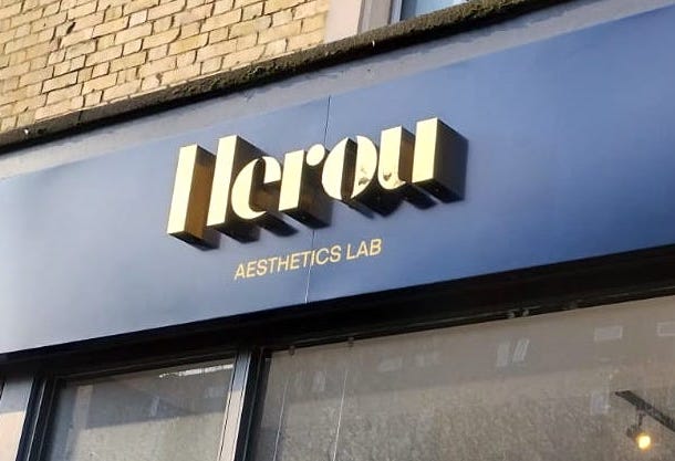
A busy high street gives each shop only a few seconds. People scan names, windows, colours, and offers. So, your shop front must make sense at once. That is why great Shop Signs help your salon look clear, trusted, and easy to find.
For hair and beauty firms, that first look can shape a sale. A fresh sign can draw the eye. It can also show your style before anyone steps inside. Yet a weak sign may hide a great team in plain sight.
This matters across North London and Hertfordshire. Many streets are packed with salons, barbers, nail bars, and skin clinics. Therefore, your sign must do more than name the shop. It must give people a reason to pause.
Your Sign Starts the Sales Talk
Your front sign speaks before your team gets the chance. It tells people who you are. Its style also hints at price, care, skill, and style.
For example, a bold sign may feel young and fun. By contrast, a clean sign may feel calm and high-end. Warm type can feel kind and open. Sharp type may feel neat and modern.
So, think of signage as part of your sales team. Plus, it can help both new and old clients find you.
The best signs make one clear promise. That may be fast cuts, calm care, bold colour, or luxury skin work. However, the message should stay simple. A shop front is not a full price list.
Shop Signs Help You Win the Street
Still, most people do not study every shop. Instead, they glance while they walk, drive, or wait. Your sign must work during that short look.
Clear Shop Signs do three key jobs. First, they show your name. Next, they show what you do. Then, they guide people to the door.
Still, many salons miss one of those steps. Some use thin text that fades from far away. Others hide the service type in a small line.
So, test your design from real viewing points. Stand on the other side of the street. Also, check the view through parked cars.
A sign should pass each test with ease. If it does not, change the size or layout. After all, a sign must be seen and read.
Clear Signs Build Trust Fast
Above all, hair and beauty work is personal. Clients trust you with their look, time, and comfort. Therefore, the shop front needs to feel cared for.
A cracked panel sends the wrong cue. Peeling vinyl can do the same. So can dead lights or mixed fonts. These faults may make the whole firm seem tired.
On the other hand, a neat sign shows pride. It suggests that details matter. Also, it helps the site feel safe and well run.
You may not have years of local fame yet. Still, your front can show that you mean business.
The same rule helps with a salon refit. New paint and chairs may lift the room. Yet old signage can hold the whole look back.
Make Your Brand Easy to Recall
A salon name should stick in the mind. Clear branding helps that happen. Therefore, use the same name, type, and tone across each touchpoint.
Your main sign should match your website. It should also fit your booking page and social posts. Plus, window graphics should feel like part of one set.
This joined-up look builds recall. A client may see your shop on the school run. Later, they may search the name at home. If the brand looks the same, they know it is you.
So, keep your core design simple. One strong logo is often enough. However, too many shapes and fonts can cause noise.
Colour needs care too. Pale tones may look soft and calm. Yet low contrast can make words hard to read. Good design keeps the style while adding more punch.
Guide People from Search to Shop
Often, a local search starts the trip. Even so, your sign must finish it. A client can follow a map and still miss a weak front.
The same issue appears near busy roads and retail sites. So, the street view should match the name shown online.
Use the same trading name in both places. Also, show the unit number when it helps. Clear window text can support the main sign.
Your website can help too. For example, add a clear photo of the shop front. Include a short “how to find us” note. Then, keep your map pin and hours up to date.
Good reviews and local links can bring people closer. Yet the final few metres still matter. Strong Shop Signs help turn online interest into a real visit.
Pick Signs That Fit the Site
Still, no two shop fronts work in the same way. Therefore, choose signs for the building, road, and viewing angle.
A fascia sign is often the main feature. It sits above the window or door. So, it should carry the name in clear type.
A projecting sign faces people along the street. Plus, it may catch eyes before the fascia appears.
Window graphics can add key details. They may show services, hours, or a booking link. Yet they should not block the whole view inside.
Lit signs can help after dark. Also, soft halo light can suit a calm beauty brand.
Pavement signs may support passing trade. However, they need clear and safe space. Check local rules and landlord terms first.
Keep the Design Clear
Good sign design is not about adding more. Instead, it makes each part work harder.
Start with the name. Make it the largest item. Next, add a short service line if the name gives no clue.
For example, “Hair, Nails and Skin” is easy to scan. A long list of each treatment is not. So, save full details for the window or website.
Use plain letter shapes. Also, leave space around each word. Crowded text feels hard to read, even when it is large.
Contrast is just as key. Dark text on a light base can work well. Light text on a dark base may also stand out. Yet a weak mix can fade into brick, glass, or sky.
Think about glare too. Glossy panels may catch strong light. Therefore, test samples at the actual site.
Plan for North London and Hertfordshire
Local context can change the whole sign plan. North London streets often feel fast and full. Hertfordshire sites may range from town centres to local hubs.
Areas such as Finchley, Enfield, Barnet, and Muswell Hill have varied fronts. Meanwhile, Watford, St Albans, Borehamwood, and Hertford bring other street types.
So, start with the way people reach you. Do they walk from a station? Can they park nearby? Or do they pass at road speed?
That answer shapes the sign. Large, clean type helps drivers. A projecting sign helps walkers. Clear unit numbers aid clients who use maps.
Also, study the whole street. A tiny sign may vanish on a wide road. By contrast, a huge panel may feel harsh on a small parade.
Meanwhile, shared and upper-floor sites need extra care. In that case, use simple door, stair, and wayfinding signs. Then, guide clients from street level to the salon.
Know When Your Sign Needs a Reset
Still, a sign need not fall apart before it needs work. Small changes can make it less useful over time.
Your service mix may have changed. Perhaps your brand now has a new logo. Maybe the street has gained more rivals. So, review the front each year.
Look for faded print, loose parts, and dead lights. Also, check that every detail is still true. Old phone numbers can waste leads.
Take photos in daylight and after dark. Next, view them on a small phone screen. This can expose weak contrast and clutter.
Ask new clients how easy you were to find. Their answers may reveal a simple fix.
Turn Signage into a Business Asset
Finally, a good sign is not just a build cost. It is a tool that works for years. Therefore, judge value across its full life.
Start with build quality. Cheap parts may save cash at first. However, early faults can cost more later.
Next, think about upkeep. Can panels be cleaned with ease? Are lights simple to reach? Can one part change without a full rebuild?
Also, plan for future offers. Keep the main sign clean and fixed. Then, use window graphics for short-term news.
After launch, track simple results from the new sign. Note walk-ins, calls, web visits, and map requests. Still, do not expect one number to tell the whole story.
A Simple Shop Sign Checklist
Before you approve new Shop Signs, ask these quick questions:
- Can people read the name across the street?
- Does the sign say what the firm does?
- Is the type clear at a glance?
- Does the design match the brand?
- Can clients spot the right door?
- Will the sign work after dark?
- Do the window signs add value?
- Are all names and details correct?
- Does the plan suit the local street?
- Have you checked site and council rules?
If one answer is no, pause the job. A small fix now can prevent a costly change later.
Shop Signs: Common Questions
What makes a good salon sign?
In short, a good sign is easy to read from real routes. It should show the name, service, and door. Also, it should match the brand.
Should a beauty salon use a lit sign?
A lit sign can help with late hours and winter trade. However, the light should fit the brand and site.
How often should shop signs be checked?
Review them each year and after a brand change. Look for faded parts, dead lights, loose fixings, and old details.
Final Thoughts: Let Your Shop Front Work Harder
Great hair and beauty firms do a lot behind the door. Yet the street can only judge what it sees first.
That is why Shop Signs matter. They help people notice, trust, recall, and find your firm. Also, they turn a plain frontage into a clear brand tool.
For sites in North London and Hertfordshire, local fit is key. The sign must suit the street, building, and viewing speed. At the same time, it must still feel like your brand.
So, keep the message clear. Use strong type, good contrast, and simple words. Then, test the view from real routes.
Your salon may offer great work. A strong sign helps the high street know it.
Contact us for a full review of your premises and get your free estimate.